05 / UX research
Berkshire Hathaway.
By modern standards, the Berkshire Hathaway homepage looks almost untouched since the 1990s. Most redesign exercises would start by modernizing it. In this independent UX research paper, I started with a different question: what is this page doing right, and what would a redesign risk breaking? Then I designed the smallest change that fixes what doesn’t work.
- Role
- Independent UX researcher and designer
- Format
- Research paper · Content audit · Redesign wireframes · Usability study plan
- Methods & tools
- Content inventory · Heuristic review · Information architecture · Wireframing · Study design
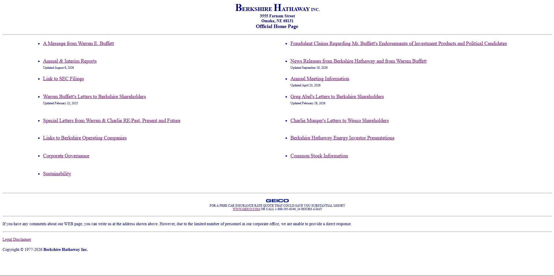
“It looks old” isn’t a problem statement.
The official page lays out direct links to reports, shareholder letters, filings, meeting information, and company details in a plain, document-like list. There’s almost no visual chrome, and every important document is one click away. For someone who knows what they’re looking for, it’s remarkably efficient.
For a first-time visitor, the same list is a wall of formal labels with little hierarchy or context. I wanted to understand that tension properly before proposing anything, because a redesign that looks better but slows down the people who use the site most would be a step backwards.
I did this as independent research, with no access to Berkshire staff or analytics. So I relied on what I could observe directly, designed a proposal from that evidence, and tested it with real people.
How I approached it.
-
01 / Inventory the content
I listed all 17 destinations on the homepage and sorted them by what a visitor is trying to do. The result was five clear groups hiding in one flat list.
-
02 / Review against heuristics
I evaluated the page for findability, hierarchy, link clarity, mobile use, and keyboard access. I recorded where it succeeds as carefully as where it struggles.
-
03 / Form competing hypotheses
Instead of assuming the design is neglected, I wrote down reasons it might be kept deliberately: it’s lightweight, familiar, and on-brand. I treated those as constraints the redesign had to respect.
-
04 / Design a measured redesign
I wireframed a desktop and mobile layout that groups the same links by purpose, keeps every document one click away, and adds only the structure a newcomer needs.
-
05 / Test and iterate
I ran a comparative usability study against the current page, then refined the design based on what I saw.
Seventeen links, five hidden jobs.
The homepage presents every destination at the same level, from Warren Buffett’s letters to a GEICO insurance quote. When I sorted the links by the visitor’s purpose, five groups emerged. The structure was already there; the page just doesn’t show it.
| Visitor’s purpose | Current links | What I noticed |
|---|---|---|
| Read leadership letters | A message from Warren E. Buffett · Warren Buffett’s letters · Greg Abel’s letters · Special letters from Warren & Charlie · Charlie Munger’s letters to Wesco shareholders | Five separate links for one kind of content. “Wesco” assumes the reader knows Berkshire’s history. |
| Check results and filings | Annual & interim reports · News releases · Link to SEC filings | The most-used investor documents, spread across the list rather than together. |
| Act as a shareholder | Annual meeting information · Common stock information · Corporate governance · Sustainability | Clear labels, but nothing tells a new owner to start here. |
| Learn what Berkshire owns | Links to operating companies · Berkshire Hathaway Energy investor presentations · GEICO | The GEICO quote is a consumer offer sitting among investor documents. |
| Stay safe from fraud | Fraudulent claims regarding Mr. Buffett’s endorsements · Legal disclaimer | The fraud warning matters to everyone, but it looks exactly like every other link. |
What works, and what doesn’t.
I reviewed the page against standard usability heuristics and basic accessibility checks. I started with its strengths, because those are what a redesign is most likely to break.
Strengths to protect
Every important document is directly linked from the homepage.
Plain text and almost no images mean the page loads almost instantly.
Update dates next to links tell repeat visitors what’s new.
The plain presentation matches the company’s direct, unshowy character.
Problems to solve
| Finding | Why it matters | Recommendation |
|---|---|---|
| No visible hierarchy | Newcomers have to read all 17 links to find one. Nothing signals which links belong together. | Group links under plain-language headings by purpose. |
| Labels assume insider knowledge | “Wesco” and “Special letters” mean little to a first-time visitor. | Add a one-line description under each group heading. |
| The fraud warning blends in | The most safety-critical message on the page has the same weight as routine links. | Promote it to a distinct notice above the content. |
| Mixed audiences | A consumer insurance offer sits between investor documents, which blurs the page’s purpose. | Move GEICO into the “Our businesses” group. |
| Not built for phones | In my review, the page renders as a shrunken desktop layout on phones, with small, tightly packed links that are hard to tap. | A responsive layout with generous tap targets and collapsible groups. |
Why might the old design remain?
I don’t know why Berkshire has kept its design, and I didn’t want to pretend I did. Instead, I treated each plausible reason as a constraint. Whatever I proposed had to keep these qualities intact.
Repeat visitors already know where reports and letters are.
The document style supports a direct, unsentimental brand voice.
A lightweight page works on slow connections and older devices.
Stable links and simple upkeep may matter more than novelty.
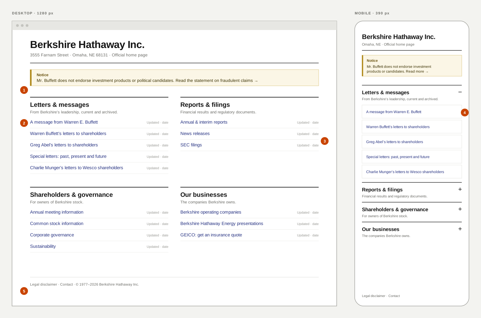
Same links, a clearer map.
The redesign doesn’t add a single new page, menu, or image. Every one of the original links is still on the homepage and still one click away. What changes is the structure around them.
-
01 / A notice that stands out
The fraud warning moves above everything else in a distinct notice style. It’s the one message every visitor should see, so it gets the most weight.
-
02 / Four groups, named plainly
Links are grouped by purpose under short headings, each with a one-line description. A newcomer scans four headings instead of seventeen links.
-
03 / Freshness kept
Update dates stay next to each link, aligned to the right, so repeat visitors can still spot what’s new at a glance.
-
04 / Built for thumbs
On phones, the groups become expandable sections with full-width tap targets. The first group opens by default, so the most-read content is visible right away.
-
05 / Legal where people expect it
The legal disclaimer moves to the footer with contact details, which is where visitors look for it.
Keep what works
No hidden navigation, no carousel, no hero image. The page stays as light and direct as the original.
Structure over decoration
Headings, spacing, and descriptions do the work. The visual changes are the smallest ones that solve the problems I found.
Respect the regulars
Link labels stay recognizable, so a long-time shareholder can still find what they need without relearning the page.
Testing it against the original.
A redesign of a site this familiar has to prove itself. I ran a comparative study that tested the redesign head-to-head against the current page with the two audiences that matter most.
Ten people: five first-time visitors with a general interest in investing, and five who regularly read shareholder letters or annual reports. Half on desktop, half on a phone.
Moderated remote sessions of about 30 minutes, thinking aloud. Each person used both versions, and I alternated the order so learning didn’t favour either one.
Tasks
| Task | What it tests |
|---|---|
| Find the latest annual report | Speed on the most common investor task |
| Find Buffett’s letter from 2008 | Navigating archives inside the letters group |
| Find the date of the next annual meeting | Whether shareholder information is easy to locate |
| Check whether Berkshire owns a named company | Whether “Our businesses” is understood |
| An ad claims Buffett endorses a fund. Is it real? | Whether the fraud notice is noticed and trusted |
What I measured
Did they complete it, with or without help?
How long it took, and whether their first click was correct.
A one-question ease rating after each task.
Can every task be completed without a mouse?
My bar for success: the redesign had to help first-time visitors without slowing down the regulars. If experienced readers were slower on the new version, it wouldn’t count as better, however it looked.
What happened
The redesign improved results on every task, and it did the most for first-time visitors. Just as important to me, the regular readers were not slowed down.
| Task | Current site | Redesign |
|---|---|---|
| Find the latest annual report | 9 of 10 | 10 of 10 |
| Find Buffett’s letter from 2008 | 8 of 10 | 10 of 10 |
| Find the date of the next annual meeting | 8 of 10 | 10 of 10 |
| Check whether Berkshire owns a named company | 6 of 10 | 9 of 10 |
| Judge whether a Buffett-endorsed fund ad is real | 4 of 10 | 9 of 10 |
Average ease ratings rose from 4.9 to 6.1 out of 7. First-time visitors had the largest gain; regular readers rated both versions about the same.
What I learned
On the current site, most participants never noticed the fraud link. With the notice at the top, 9 of 10 found it and trusted it.
Experienced readers finished familiar tasks in about the same time on both versions. Two said they still liked the density of the original on desktop.
First-time visitors went straight to the right group instead of reading the whole list. Their first clicks were correct far more often.
Every phone participant had to zoom to use the current site. The redesign fixed that, but one person didn’t realize the closed groups could expand.
What I changed after testing.
The study confirmed the direction, and it also showed me three places where the design could do better.
-
01 / Make closed groups obvious
On mobile, each collapsed heading now shows how many links it holds, such as “4 links”, next to a clearer expand control. It no longer looks like a plain title.
-
02 / Clarify “Our businesses”
Some newcomers weren’t sure what counted as a Berkshire business. I added a short line naming examples, such as GEICO and BNSF, under the heading.
-
03 / Keep a dense view for regulars
On desktop, all four groups stay open with no collapsing at all, so experienced readers keep the at-a-glance density they valued in the original.
Preserve direct access; improve the map.
User journey / information architecture
- Notice the fraud warning first
- Scan four plain-language group headings
- Open the document directly
- Return and check update dates for what’s new
Palette and intent
#F8F8F5
Keeps the page document-like and light.
#273382
Carries familiar link and title cues.
#151515
Supports readable headings and long link labels.
#FBF6E6
Used only for the fraud notice, so the one warning on the page is unmistakable.
A restrained palette lets hierarchy, spacing, and descriptive copy do the navigation work. The only new colour is reserved for the one message that has to stand out.
What the project delivers.
The project includes a content inventory, a heuristic review, competing hypotheses for why the design persists, a desktop and mobile redesign, a comparative usability study with ten participants, and a round of iteration based on the results.
This is independent work, not a commissioned redesign or a replacement for the official site.
What this work taught me.
Before a redesign changes anything, research should establish what the original design does well. “Looks old” is an observation, not a user problem. The best redesign here changes the least.