03 / Product concept · Personal finance
Recurl.
Recurl is a web and mobile app for the bills that repeat: subscriptions, free trials, insurance and utilities. It shows what’s about to go up, how many days are left to cancel, and guides people through cancellations designed to keep them paying. The design went through three versions before it became an app you can actually use, and you can try that app below.
- Role
- Product designer · Concept, UX, visual system and prototype
- Format
- Self-initiated concept · Web app with four views, iPhone app, light and dark modes
- Methods & tools
- Figma variables, components and prototyping · HTML, CSS and JavaScript prototype · Figma Plugin API
- Status
- Working prototype · Sample data only
Nobody forgets to pay. They forget what they agreed to.
A subscription usually starts with a free week and a card number the form insists on. The trial ends, the charge is small, and it keeps going. Add a streaming price rise, a cloud plan that grew and an insurance policy that renewed at a higher rate because nobody called, and the leak becomes real money.
Banking apps show past charges. They don’t say which ones are about to go up, which cancellation window closes on Friday, or which company makes leaving hard on purpose. I designed Recurl around a sample household of eight recurring bills that is losing $612 a year, and every screen answers one question: what needs a decision this week?
I rebuilt it twice.
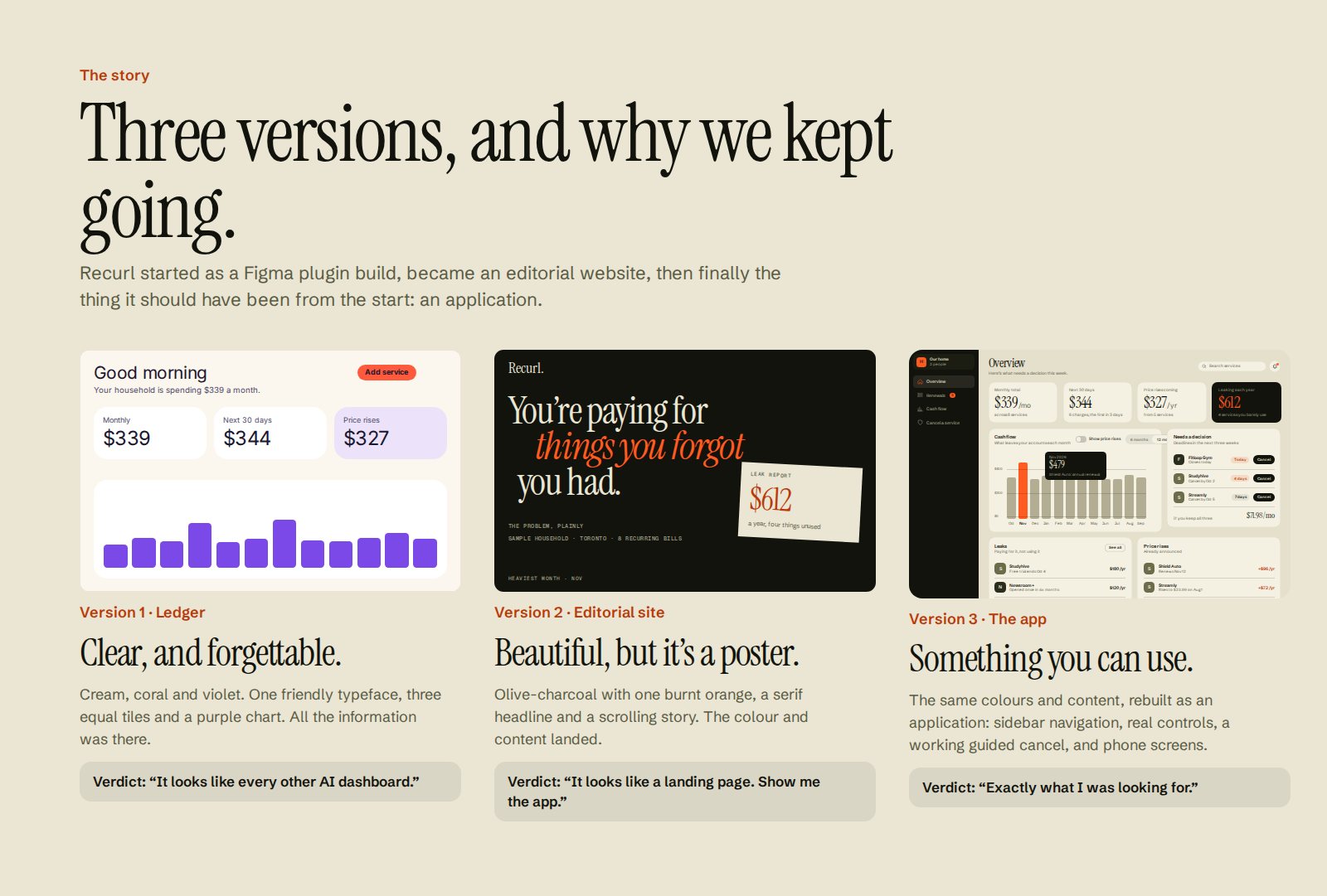
The content was right from early on: a cash-flow projection, renewal windows, price rises, leaks and a guided cancel. Getting the form right took three tries, and each version was replaced for a specific reason.
-
Version 1 / Ledger
Cream, coral and violet, one friendly typeface, three equal tiles and a purple chart. All the information was there, and it looked like every other finance dashboard. I dropped the visual direction and kept the content.
-
Version 2 / Editorial site
Olive-charcoal, bone and a single burnt orange, a serif headline and a scrolling story about one household. The colour and the writing landed, but it was a poster for an app, not an app. The feedback was “show me the product”.
-
Version 3 / The app
Same palette, same content, rebuilt as an application: sidebar navigation, search, tables, a detail drawer, a tab bar on mobile and a guided cancel you click through. I also removed every small all-caps label. Nothing is smaller than 13 px, and everything is in sentence case.
| Version 1 · Ledger | Version 2 · Editorial | Version 3 · The app | |
|---|---|---|---|
| What it is | A set of dashboard frames | A scrolling marketing page | An application with navigation and states |
| Navigation | None between screens | Anchor links down one page | Sidebar on web, tab bar and back stack on mobile |
| Type | One rounded sans everywhere | Serif, grotesk and tiny mono caps at 10–12 px | Serif for numbers and titles only; everything else 13 px or larger |
| Colour | Six hues | Olive-charcoal and one orange | Same palette, with light and dark modes |
| Cancelling | A diagram of the flow | A demo panel beside the story | A clickable page you can fall for, with the trap named |
What needs a decision this week.
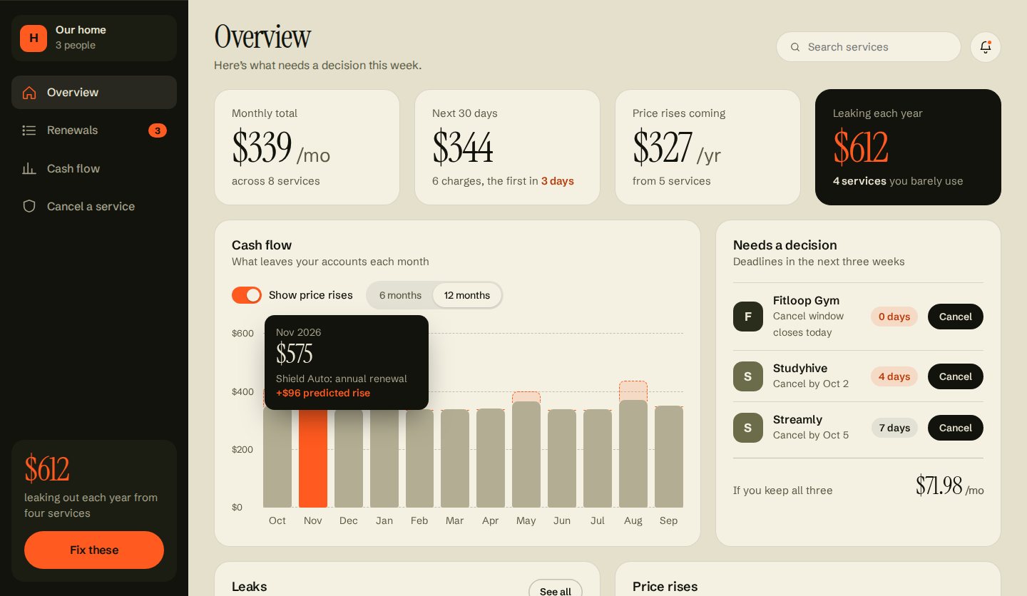
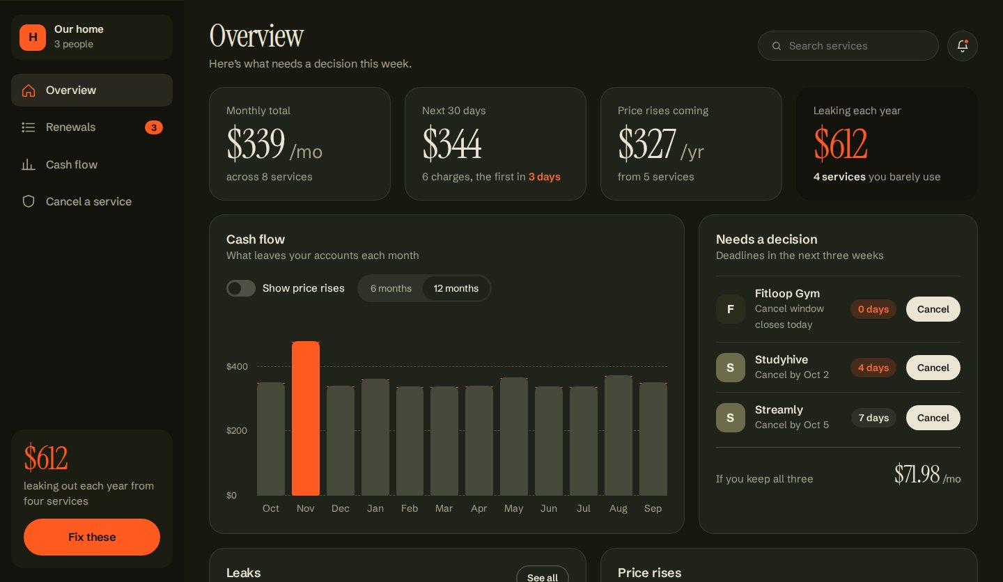
The Overview opens with four numbers: the monthly total, what leaves in the next 30 days, the price rises already announced, and the yearly leak. The leak is the only dark card, because it’s the one that calls for action.
-
Deadlines, not dates
“Needs a decision” lists the next three cancellation windows, sorted by days left, with a Cancel button on each row. The total underneath shows what keeping all three costs.
-
A chart you can question
Ordinary months are one quiet grey and the heavy month is orange. A toggle adds announced price rises as dashed outlines on top of the bars, so a forecast never looks like a charge. Hovering or focusing a bar explains what lands that month.
-
Leaks and rises side by side
Below the chart, one list shows services you pay for but barely use, and another shows announced increases. Each row opens the service’s details.
Sorted by how little time you have.
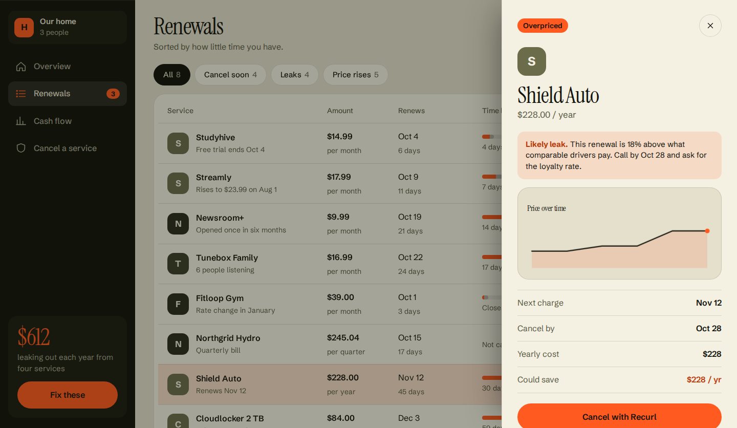
Renewals is the working view. Every service has one row, with filters for cancel soon, leaks and price rises, plus search. The track in each row shows the window to cancel in orange and the locked-in period in grey. Selecting a row opens a drawer with the reason to act, the price history, the key dates and one clear next step.
A year of billing, with the heavy months marked.
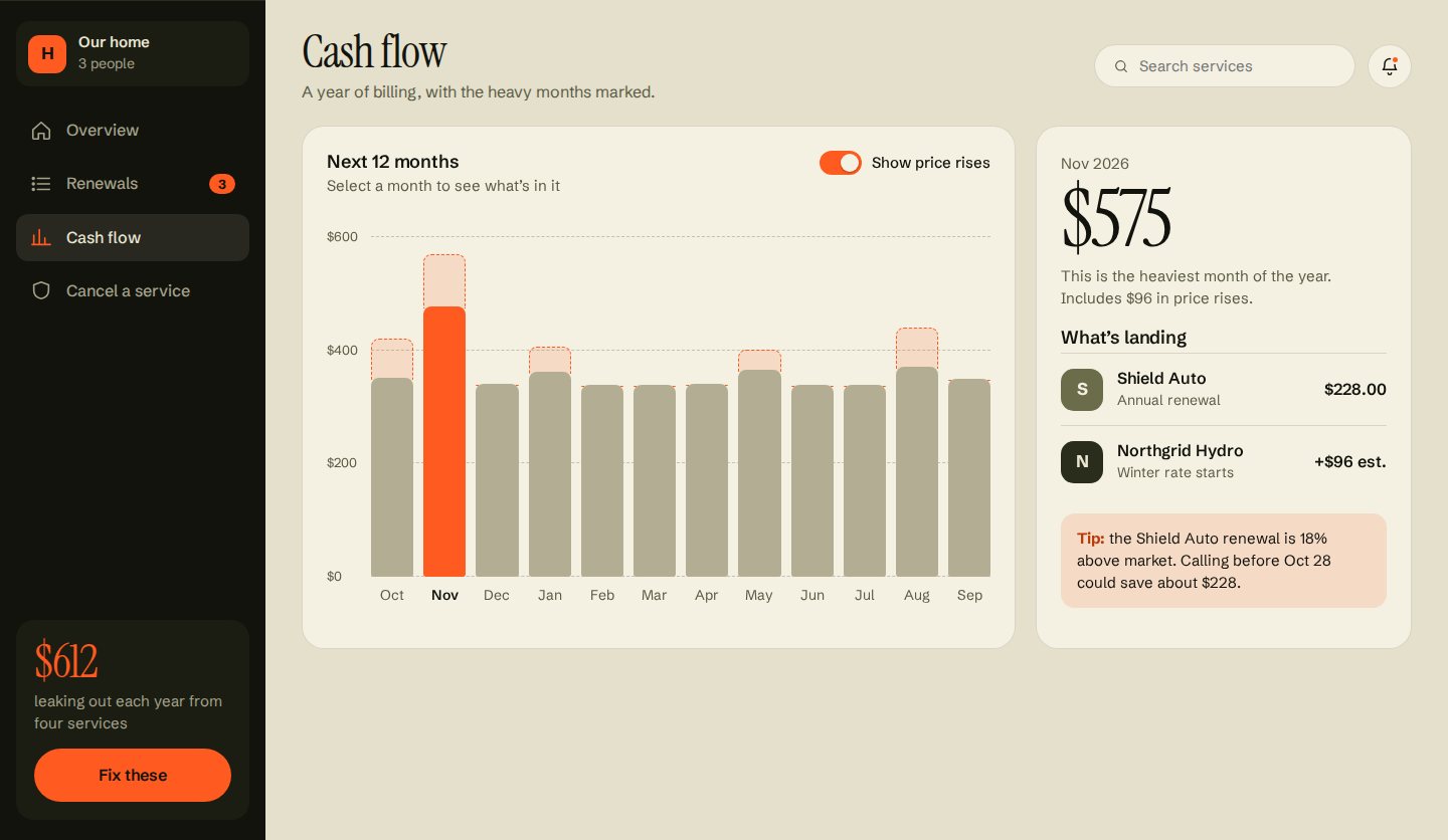
Cash flow is the chart given room to breathe. Selecting a month shows what lands in it and, where it helps, a tip. November carries the car insurance renewal, and the panel points out that calling before the deadline could save about $228.
A page you can fall for, with the trap named.
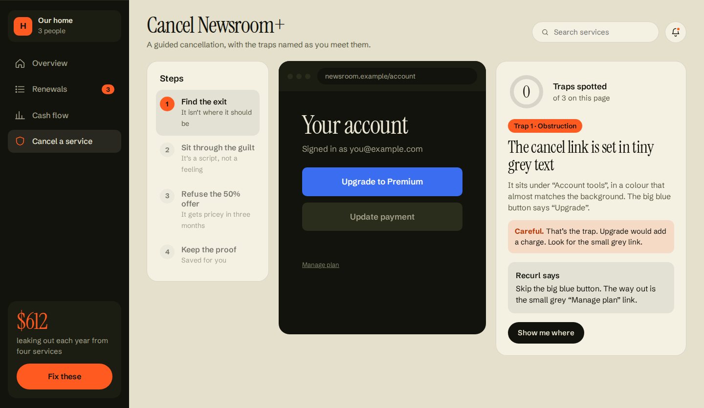
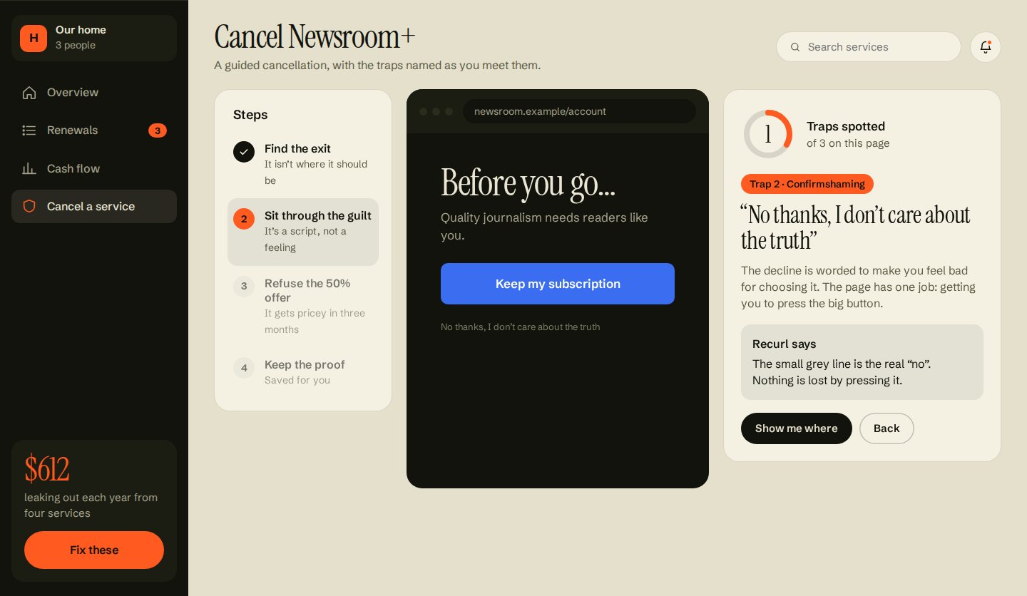
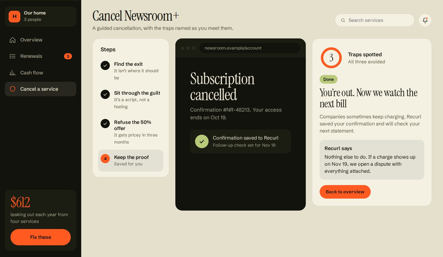
This is the hardest problem in the product, and version 3 made it something people practise instead of read about. The middle of the screen is a realistic cancellation page from a fictional publisher. The steps are on the left, and a guide on the right names each trap as it appears.
If someone clicks the big blue button, the guide shakes and explains what would have happened. “Show me where” highlights the real way out. A ring counts traps spotted, and the final step saves the confirmation and sets a check on the next statement.
| Trap | What the company does | What Recurl says |
|---|---|---|
| Obstruction | Hides the cancel link in tiny grey text under a big “Upgrade” button. | “Skip the big blue button. The way out is the small grey link.” |
| Confirmshaming | Words the decline to make you feel bad for choosing it. | “The small grey line is the real no. Nothing is lost by pressing it.” |
| Forced continuity | Offers half price for three months, then quietly returns to full price. | If you take the offer anyway, Recurl reminds you on day 80. |
Pattern names follow the deceptive.design catalogue.
Made for the thirty seconds people have.
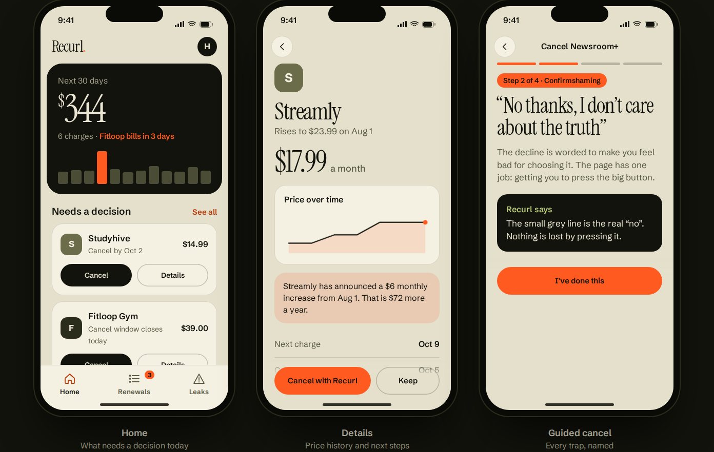
The phone is for a quick check on the bus. Home leads with one number, what leaves in the next 30 days, and then the two decisions that can’t wait, each with Cancel and Details buttons. The tab bar holds Home, Renewals and Leaks. Details show the price history, and the guided cancel runs one step per screen with a progress bar.
One accent, used sparingly.
Every colour has a job. The olive-charcoal ground carries the sidebar and the cards that need attention, bone is the working canvas, and orange marks only what needs a decision: a deadline, a trap or a leak. Instrument Serif is used for numbers and screen titles only. Schibsted Grotesk handles everything else, at 13 px or larger.
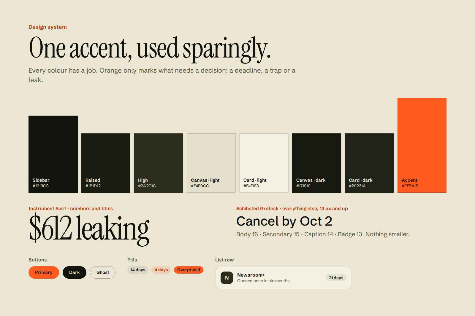
Colours are Figma variables with light and dark modes, and the prototype follows the device setting. In dark mode, the canvas becomes a deep olive rather than pure black, so cards still separate from the page.
| Pair | Contrast | Note |
|---|---|---|
| Text on card · light | 16.5 : 1 | Body text |
| Muted on card · light | 6.1 : 1 | Secondary text |
| Accent ink on card · light | 5.0 : 1 | Deadlines and highlighted amounts |
| Accent ink on canvas · light | 4.3 : 1 | Just under AA for small text, for example the mobile “See all” link. I’d darken the ink slightly before a build. |
| Dark text on accent | 6.0 : 1 | Primary buttons |
| Text on card · dark | 12.7 : 1 | Body text in dark mode |
| Muted on card · dark | 6.2 : 1 | Secondary text in dark mode |
Things move once, then stay still.
Views slide and fade in. Bars and price lines draw once, headline numbers count up once, and nothing loops. The detail drawer slides in from the right. Everything turns off when the device asks for reduced motion.
What I’d test first.
Recurl is a concept with sample data. It hasn’t been tested with users.
-
01 / The guided cancel
Test it with people who recently tried to cancel something. Does practising on a realistic page help them on the real one, or just add reading?
-
02 / Trust in the numbers
“18% above market” and “nobody has signed in for 41 days” are strong claims. People need to see where they come from before they’ll act on them.
-
03 / Notice periods by region
Cancellation rules differ by province, state and contract, so the deadline logic needs legal input before anyone relies on it.
-
04 / Accessibility
Fix the one contrast pair that falls short, and check the renewal tracks and chart with a screen reader, not only as colour and length.
What I took from it.
The content was right early. The form wasn’t. Listening to “it looks like a landing page” turned a nice poster into something people can use.