02 / Product concept · Health
Dayward.
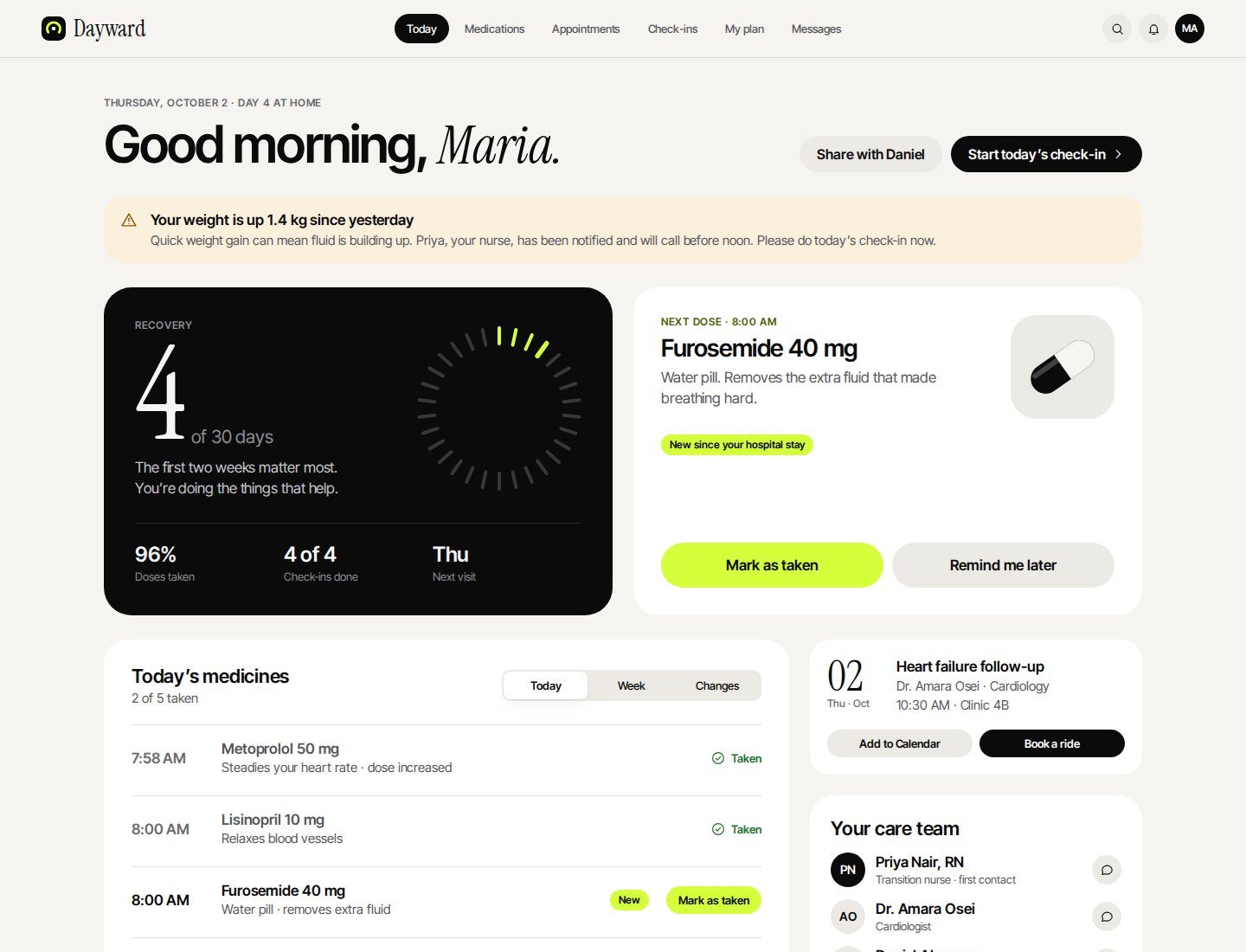
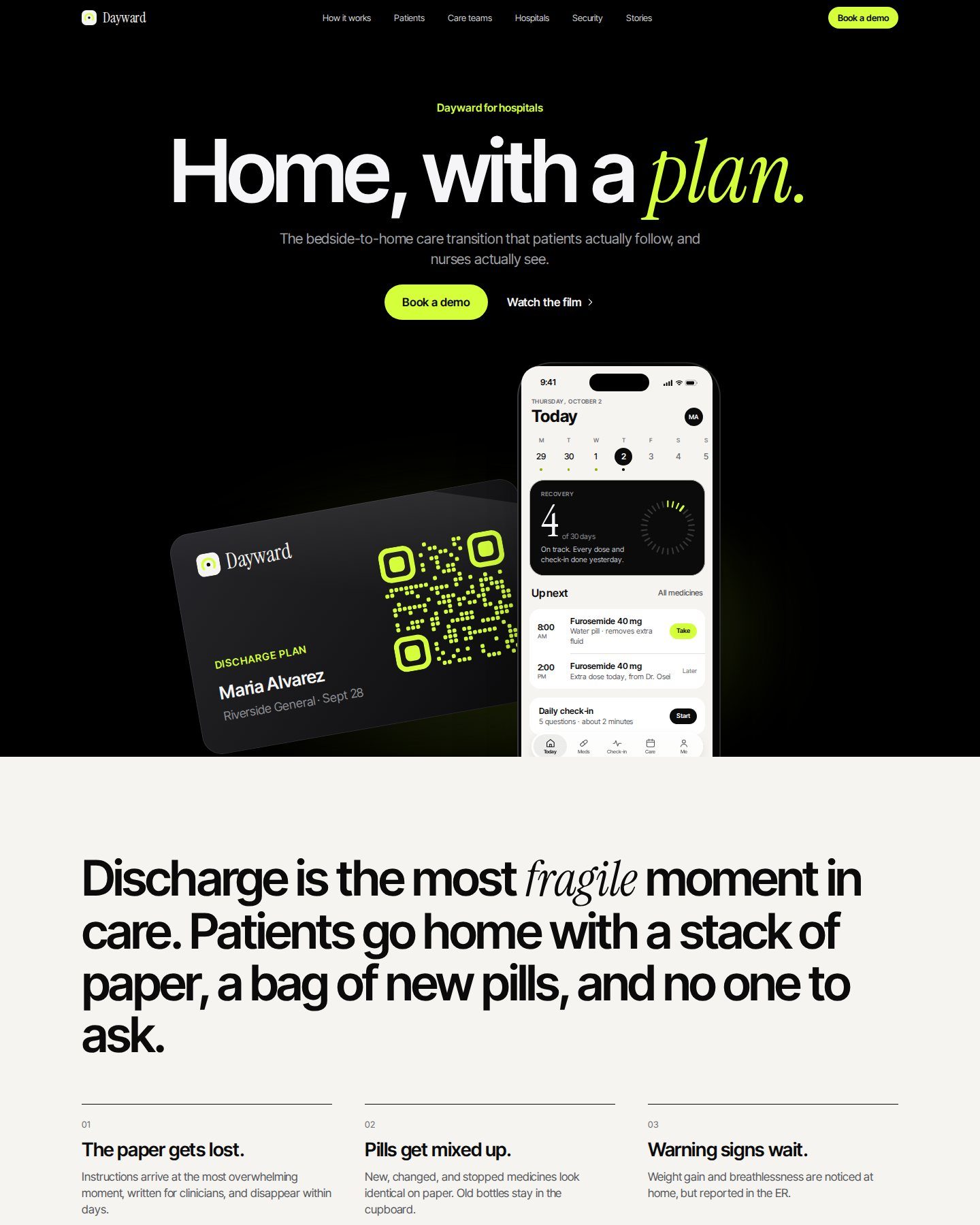
Dayward is a care transition product for the 30 days after someone leaves hospital. It turns discharge paperwork into one clear plan for today, and gives the care team a single list of who needs a call first. I designed it end to end: the iPhone app, the patient web portal, the care team console, the marketing site and the design system behind all four.
- Role
- Product designer · Research framing, UX, UI and design system
- Format
- Self-initiated concept · 4 surfaces and one shared design system
- Methods & tools
- Figma variables, components and prototyping · Figma Plugin API · WCAG contrast checks
- Status
- High-fidelity concept · Usability testing planned
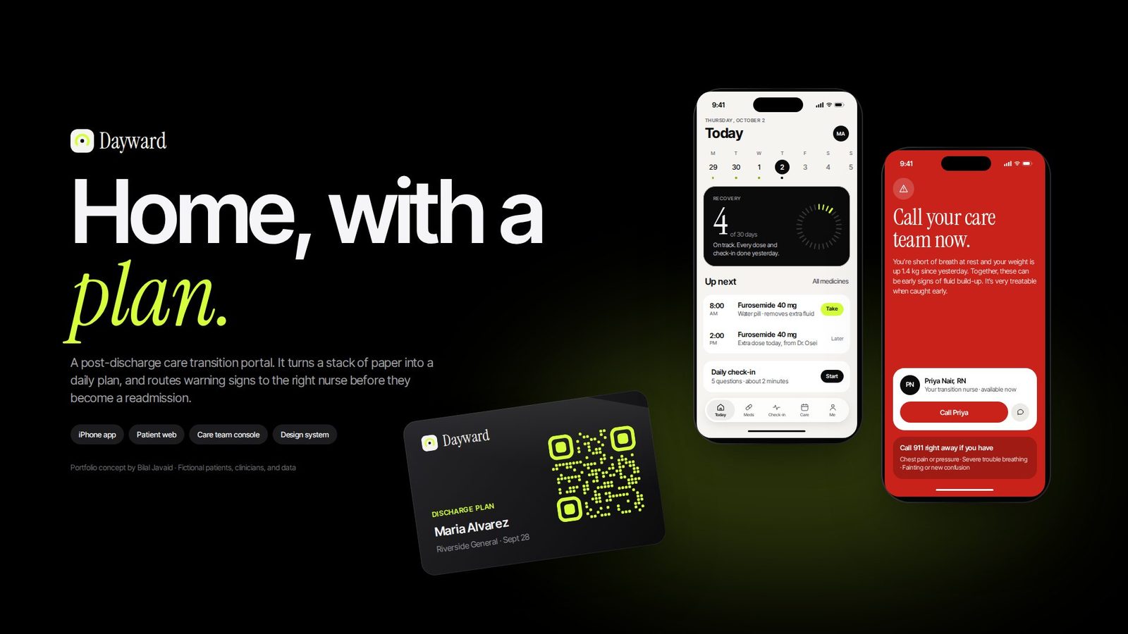
The plan breaks down at home.
People go home from hospital with new medicines, changed doses, stopped medicines, follow-up visits and warning signs to watch for. Almost all of it arrives on paper, on the most tiring day of their stay. The care team often has no daily signal of how someone is doing until they are back in the emergency department.
I framed the product around three people. A patient home after a heart-failure stay, who uses her phone for messages and photos. Her daughter, who wants to know things are okay without calling three times a day. And a transition nurse who follows a large panel of patients and needs to know who to call first.
Everything on this page: the framing, the information architecture, every screen across four surfaces, the design system, the prototype links and the design rationale.
The three people above are proto-personas, not research findings. Checking them with patients and nurses is the first step in my validation plan (section 09).
Four rules before any screen.
I wrote these before designing anything, and used them to settle arguments with myself later.
Today first
The home screen answers “what do I do now?”, not “here is all your data”.
Plain language
Every medicine explains why you take it, in one sentence a tired person can read.
Escalate to a person
A warning sign leads to a named nurse, not a generic hotline.
Calm by default
Colour is held back for status, so urgency stands out on the day it matters.
One question: what do I do now?
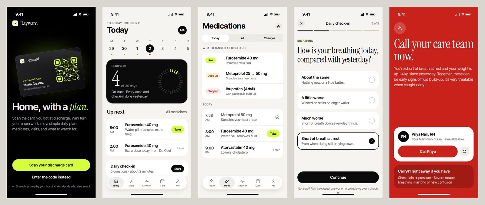
The app is where patients spend their time, so it got the most care. Each screen has one job, and the hierarchy is built so the next action is always the most visible thing.
-
The recovery count
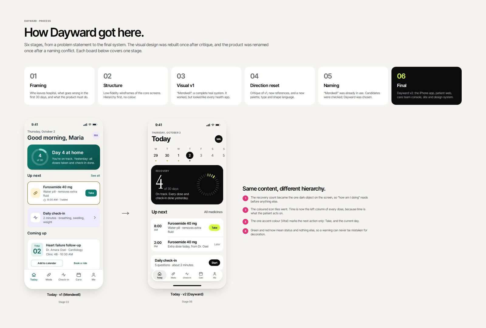
“Day 4 of 30” is the one dark object on Today, so “how am I doing?” reads before anything else. It replaced a panel of statistics.
-
Time leads each dose
Time is the left column of every dose row, because time is what the patient acts on. “Take” sits on the row, so there is no extra screen to open.
-
What changed at discharge
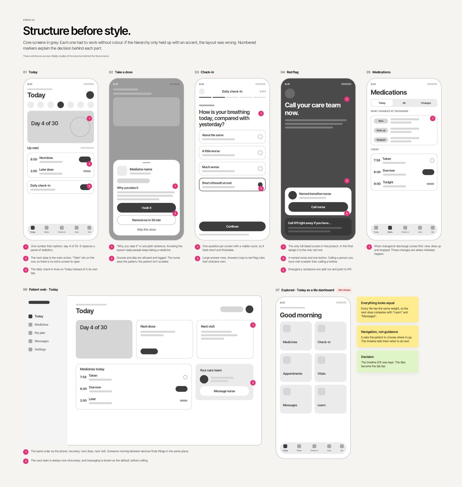
Medications opens with new, changed and stopped medicines, because those changes are where mistakes happen.
-
One question per screen
The daily check-in shows one question at a time with a visible count, so it feels short enough to finish every day.
-
The only red screen
A red-flag answer leads to the only full-bleed red screen in the product. It explains why in plain words, offers one button to call a named nurse, and separates true emergencies that should go to 911.
Who needs a call today?
The console is the other half of the product. Every check-in answer becomes a signal, and the nurse’s job is to act on the right ones first. I sorted the queue by severity rather than arrival time, and put the patient’s recent trend next to the flag, so the nurse can decide without opening three tabs.
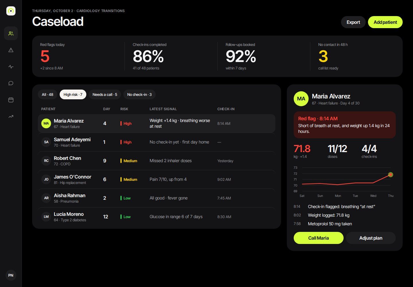
The biggest risk here is alert fatigue. If too many check-ins raise a flag, the console becomes noise. That’s why the rules behind the flags need to be owned by clinicians, and it’s one of the first things I’d test with nurses.
Same order on every screen.
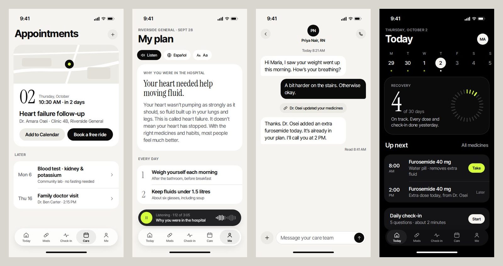
The patient web portal keeps the phone’s order: recovery, next dose, next visit. Someone moving between a phone and a family laptop finds things in the same place. The marketing site speaks to hospitals, who are the buyers, but leads with the patient’s experience.
I threw away the first version.
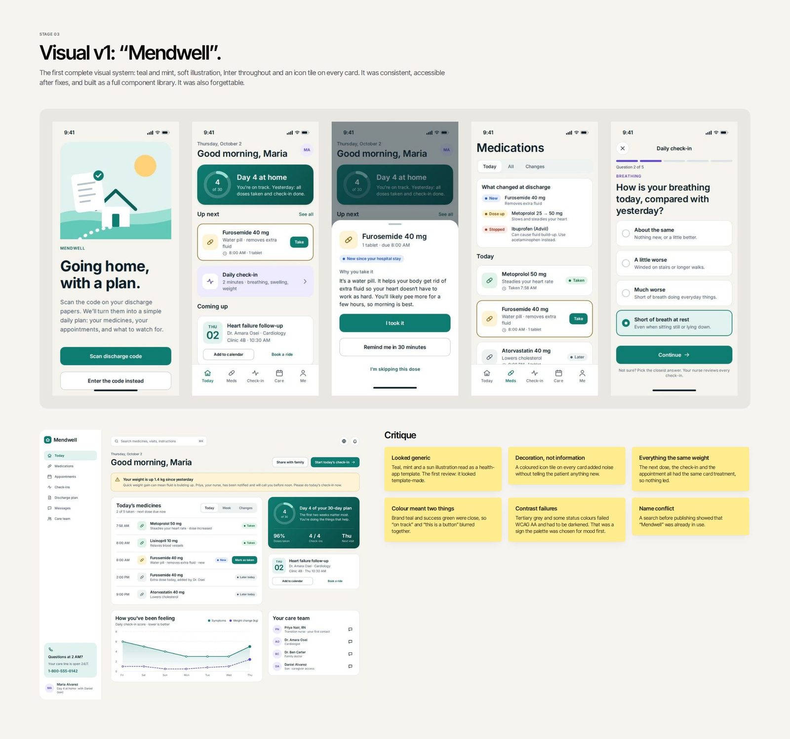
The first complete version was called Mendwell. It was teal and mint, with soft illustration and an icon tile on every card. It was consistent, and it worked, but it looked like every health app template. So I kept the structure and content and rebuilt the visual language from scratch.
-
01 / Structure in grey
I drew the core screens as low-fidelity wireframes. Each had to work without colour: if the hierarchy only held up with an accent, the layout was wrong. I also explored Today as a tile dashboard and rejected it, because every tile had the same weight and the next dose got lost.
-
02 / Version 1, then critique
Teal read as generic. Icon tiles decorated without informing. The brand colour and the success colour were too close, and some greys failed WCAG AA contrast, a sign the palette had been chosen for mood first.
-
03 / Direction reset
I looked outside healthcare, at products that feel confident because they hold back: Apple’s product pages for one idea per view, Razer for a dark canvas with one electric accent, and Coalatree for a warm editorial voice.
-
04 / Renaming
A search before publishing showed “Mendwell” was already in use. I chose Dayward (day + homeward) because it describes the job, recovery at home one day at a time. A trademark check would still be needed before launch.
One accent, one job.
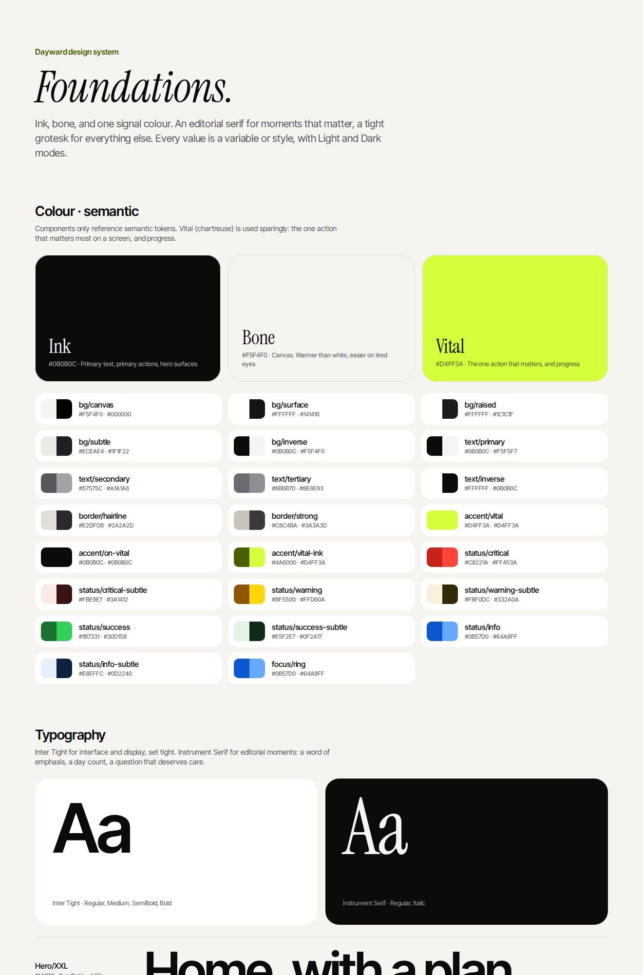
Black and a warm bone white carry the brand. A single electric green, which I called Vital, marks the next action and nothing else. Red, amber and green mean status and are never used as decoration, so a warning can’t be mistaken for branding.
#0B0B0C
Text, the recovery card and primary buttons.
#F5F4F0
The canvas. Warmer than white, so long reading feels calmer.
#D4FF3A
The next action and today’s date only. Always paired with ink text, never used as text on white.
#C8221A
Red flags and nothing else.
The type pairs Inter Tight, for interface text and large numbers, with Instrument Serif italic for a few human moments, such as greetings and the red-flag headline. Using the serif sparingly is what keeps it effective. Corners follow a five-step scale (12, 22, 28, 38 and a full capsule) with continuous smoothing.
AA or it doesn’t ship.
I calculated the contrast of every text and background pair. When a tertiary grey or a status colour failed, I darkened it until it passed rather than keeping the shade I liked.
| Pair | Contrast | Use |
|---|---|---|
| Ink on bone | 17.9 : 1 | Body text and headings |
| Secondary grey on bone | 6.5 : 1 | Supporting text |
| Tertiary grey on white | 5.3 : 1 | Captions and metadata |
| Ink on Vital | 17.0 : 1 | Primary action buttons |
| Critical red on white | 4.8 : 1 | Status labels |
| White on critical red | 5.7 : 1 | The red-flag screen |
| Vital on white | 1.2 : 1 | Never used for text. This is why Vital is always a fill. |
Beyond contrast, the check-in asks one question at a time with large answer rows, and the red-flag screen never relies on colour alone: it says what’s wrong in words. Dynamic Type, VoiceOver and reduced motion still need checking on real devices.
What would prove it works.
Dayward hasn’t been tested with patients or clinicians yet. If it were a real product, success would show up as fewer 30-day readmissions, more doses logged on time, a shorter time from a red-flag answer to a nurse’s call, and more follow-up visits kept. Here’s how I’d get there.
-
01 / Usability test the core flows
Five to eight recently discharged patients, including older adults and a caregiver: log a dose, report a symptom that should trigger a red flag, and find out who to call.
-
02 / Interview transition nurses
Check the proto-personas and the console’s triage order before anything is built, and ask how many alerts a day is too many.
-
03 / Give clinicians the red-flag rules
Symptom thresholds are clinical decisions, not design ones. I’d test the red-flag wording separately, for urgency without panic.
-
04 / Test on real devices
Largest Dynamic Type, VoiceOver and reduced motion, on real phones.
What I took from it.
The hardest decision wasn’t a screen. It was throwing away a finished, working first version because it looked like everything else, and keeping only the thinking underneath it.